Japandi interior design blends the warmth of Scandinavian minimalism with the refined restraint of Japanese aesthetics, creating calm rooms that feel simple, tactile, and lived-in. If you’ve admired soft neutral palettes, low-slung furniture, and natural materials that age gracefully, Japandi interior design gives you a framework to bring that look to every space—from the entry and living room to the bathroom and home office—without losing practicality or comfort.
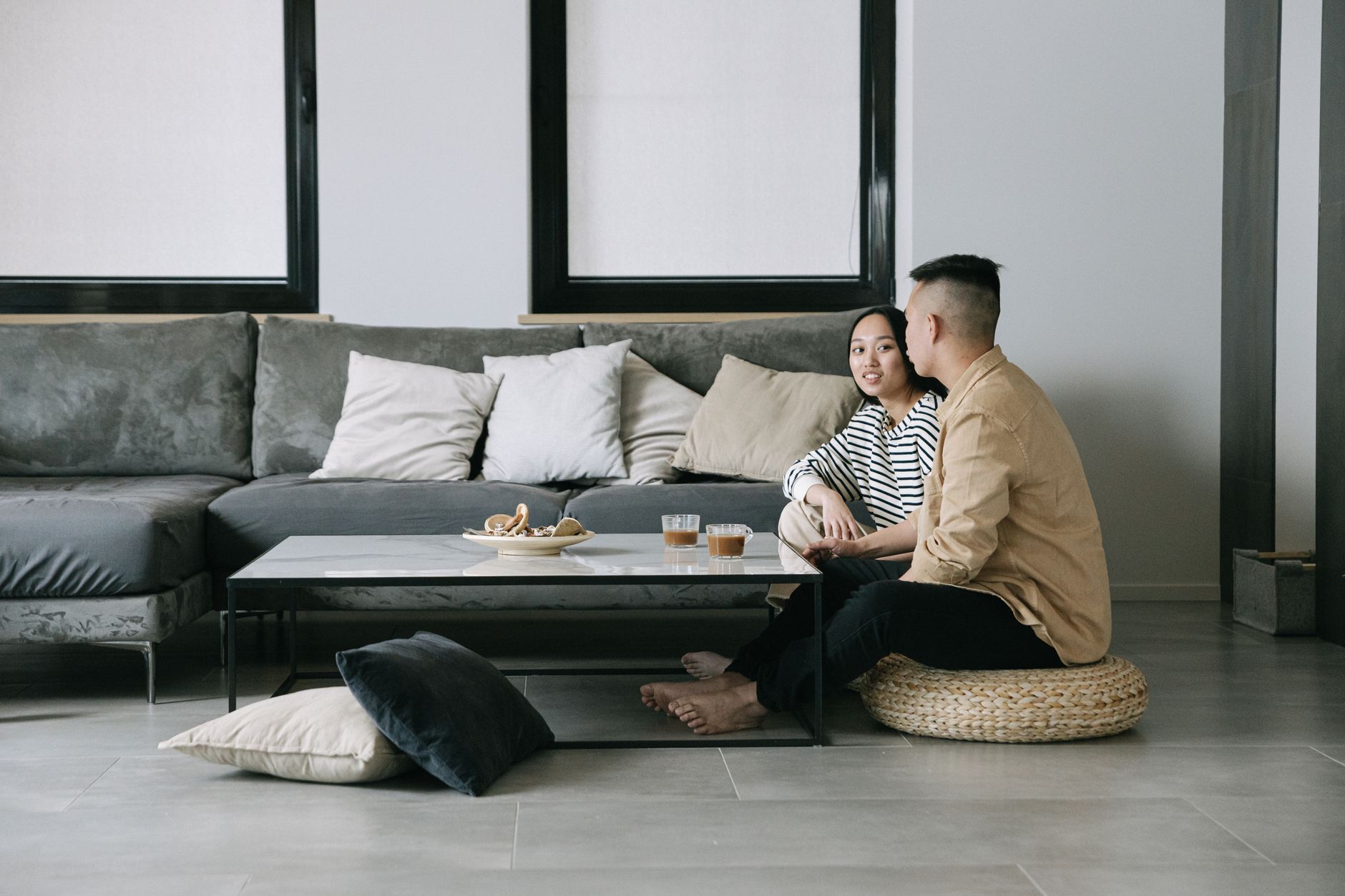
This in‑depth guide turns inspiration into action. You’ll find core principles, color and material playbooks, furniture blueprints, lighting plans, budget paths, and maintenance routines. It also includes checklists and room‑by‑room examples so you can move from idea to clear next steps. For more ideas across styles, browse the Home Décor & Design posts on our site at Home Décor & Design.
Japandi interior design: the essentials
Japandi mixes the Scandinavian ideas of light, coziness, and human‑scale function with the Japanese pursuit of simplicity, balance, and quiet beauty. Think tactile woods, linen and cotton, handmade ceramics, matte surfaces, diffused light, and a small but intentional set of objects. Spaces feel pared back yet familiar and warm.
Four ideas underpin the style:
- Less but better: Choose fewer pieces that do more work, both visually and functionally. Edit often so the good things can breathe.
- Natural and tactile: Favor oak, ash, walnut, bamboo, rattan, stone, clay, paper, and natural fibers. Texture is your pattern.
- Muted, warm neutrals: Airy whites, soft beiges, mushroom taupes, warm grays, pale putties, and occasional charcoal accents.
- Honest imperfection: A wabi‑sabi attitude that welcomes patina, visible joinery, and handcrafted irregularities.
Japandi thrives when you define a clear purpose for each room, remove visual noise, and layer texture over a restrained palette. The result is serenity that’s not sterile—rooms feel used, not staged.
Color palettes and finishes that feel calm
Color in this style acts like background music: it shapes the mood without shouting. Aim for a 60/30/10 balance—dominant base tone (60), supporting neutrals (30), and accents (10). Here’s a reliable palette to start with, plus variations to adapt for different light levels and preferences.
- Base (60%): Warm white (not bluish), light putty, or pale greige for walls. These soften daylight and help avoid starkness.
- Secondary (30%): Light oak or ash; mushroom taupe textiles; warm gray ceramics; matte black metal for small contrasts.
- Accents (10%): Charcoal, espresso brown, or deep umber; sage or olive green in small doses through plants or art.
Low‑light rooms: Use slightly warmer walls (e.g., putty or light taupe) and a touch more contrast so spaces don’t read flat. Brushed brass details or textural linen can bounce and diffuse light.
Bright, sun‑flooded rooms: Cooler white walls can work if you offset them with warm wood and wheat‑toned textiles to avoid a clinical feel.
Finish rules:
- Prefer matte or eggshell paint; shiny finishes feel out of tune and reflect glare.
- Use natural oils or low‑sheen wax on wood so grain and texture read honestly.
- Mix soft and coarse: linen next to smooth ceramic; rough rattan beside matte metal; wool over jute.
Sample strategy:
- Paint test cards in your chosen three wall tones. Move them around morning, midday, and evening to see how they shift.
- Place a piece of oak, a ceramic plate, and a linen swatch near the paint cards. Choose the combination that looks quiet at a distance but reveals detail up close.
- Lock your palette and repeat it through the home for cohesion.
Materials and textures: your tactile toolkit
Materials carry the personality of Japandi. Think about touch as much as sight. The goal is a subtle interplay of textures that stays quiet from across the room but reveals richness as you approach.
- Woods: Light oak and ash are workhorses; walnut adds depth. Choose pieces with visible grain and simple profiles.
- Stone & tile: Honed (not polished) limestone, travertine, slate, or tumbled porcelain in neutral tones. Subway tile with matte glaze works well in kitchens and baths.
- Textiles: Linen, cotton, hemp, and wool blends. Look for slubbed or gauzy weaves. Keep sheen low. For upholstery, performance linen blends balance texture and durability.
- Paper & fiber: Shoji‑style washi lamps, rice paper pendants, rattan seats or baskets, jute or sisal rugs layered with soft wool.
- Ceramics: Hand‑thrown or hand‑glazed with subtle variation; matte glazes and rounded forms are ideal. A single vase with a branch is often enough.
Texture layering recipe (works in nearly any room): one smooth surface (painted wall), one organic surface (wood), one soft textile (linen), one structured textile (woven jute), one crafted object (ceramic, carved wood), and one natural element (plant, stone bowl). Keep patterns minimal—pinstripes or small checks instead of busy motifs.
Sourcing tip: When buying natural materials online, order swatches. Photograph them in your space at different times of day so you can judge texture, color shift, and how fibers read in your actual light.
Furniture and layout planning for real homes
Furniture anchors Japandi spaces by setting eye level and flow. Emphasize low, grounded silhouettes with legible shapes. Comfort matters; the look should support slow mornings and long evenings.
- Sofa: A low oak or ash base sofa with linen or cotton slipcovers; box cushions with minimal piping. Colors: oatmeal, sand, mushroom, warm gray.
- Chairs: Wishbone or paper‑cord seats; spindle or safari‑style chairs; upholstered lounge chairs with wooden arms. Avoid busy upholstery.
- Tables: Solid wood coffee tables with rounded corners; oblong or rectangular dining tables with softened edges; small stone or ceramic side tables.
- Storage: Closed storage reduces visual noise. Use sideboards, built‑ins with flat fronts, and lidded baskets for open items.
- Scale: Leave 30–36 inches (76–91 cm) for circulation. Use fewer, larger pieces rather than many small ones.
Layout moves that work:
- Frame conversation: sofa and two chairs around a low table; avoid pushing everything against the walls.
- Float furniture: pull the sofa 8–12 inches (20–30 cm) from the wall so the room can breathe.
- Create a visual pause: add an empty stretch of wall or floor where the eye can rest.
Measurement cheat sheet:
- Coffee table height: 14–17 inches (36–43 cm). Distance from sofa front: roughly 16–18 inches (41–46 cm).
- Dining table height: 28–30 inches (71–76 cm); chair seat height: 17–19 inches (43–48 cm).
- Bedroom walking space: keep 24–28 inches (61–71 cm) clear on both sides of the bed.
Choosing fewer pieces: Before buying, list the top three activities the room supports. If a piece doesn’t help with those activities, skip it. This keeps the look streamlined without feeling sparse.
Lighting layers, bulbs, and controls
Light shapes how Japandi spaces feel as much as wood and textiles do. Aim for three tiers—ambient, task, and accent—and choose warm, diffused sources over glare.
- Ambient: Linen or paper pendants, rice paper globes, drum shades with warm bulbs (2700–3000K). In large rooms, use two or three pendants in a line.
- Task: Adjustable floor lamps near seating; under‑cabinet lighting in kitchens; desk lamps with metal shades and fabric cords at workstations.
- Accent: Slim picture lights, small spotlights on shelves, or candle‑equivalent LED lanterns to add soft pools of light.
Bulb choices:
- Color temperature (K): 2700K for cozy rooms; 3000K for kitchens and desks; mix carefully to keep a consistent mood.
- CRI (Color Rendering Index): 90+ makes wood and textiles look natural.
- Dimming: Dimmer switches create evening ambiance and reduce harsh edges.
Wiring and placement: Use fabric‑covered cords or tidy cord channels. Mount switch heights around 42–48 inches (107–122 cm). For pendants over dining tables, hang 28–34 inches (71–86 cm) above the tabletop for intimacy.
Glare control: Choose diffusers like frosted globes or paper shades, and aim lights away from eye level. Layering smaller lamps often feels softer than one bright overhead fixture.
Room‑by‑room playbook
Use this section as a blueprint. For each room you’ll find a goal, a pared‑back shopping list, and layout moves that work in most homes.
Entry
Goal: Welcome without overwhelm. A clear drop zone and calm first impression.
- Low wood bench with a woven basket underseat for shoes.
- Wall peg rail in oak or ash; a small tray for keys; a simple round mirror.
- Jute runner and a compact paper lantern pendant.
Layout: Keep the center line open; mount pegs at two heights to separate coats and bags.
Living room
Goal: Grounded comfort for conversation and quiet reading.
- Low linen sofa in sand; two paper‑cord chairs; oak coffee table with round corners.
- Wool flatweave layered over jute; linen curtains with black metal rods.
- Two ceramics on the credenza, one plant with interesting form (olive, rubber, or ficus). Choose matte, neutral planters.
Layout: Center the seating around a low table; add a floor lamp behind a chair for reading light; leave a clear path across the room.
Dining
Goal: Quiet focus on food and company.
- Solid‑top rectangular or oblong table; curved chairs with paper‑cord seats for texture.
- Single paper globe pendant hung low for intimacy.
- Textural runner, linen napkins, one sculptural bowl.
Layout: Maintain 36 inches (91 cm) clearance around the table; keep the table center clear and style the sideboard instead.
Kitchen
Goal: Clear surfaces and easy prep.
- Flat‑front cabinets in warm white or light putty; matte black or patinated brass hardware.
- Open shelf only where you can maintain neat, repeated forms (stacks of white bowls, clear jars, wood boards).
- Honed stone or butcher block; linen café curtains; warm under‑cabinet lighting.
Layout: Corral utensils in a stone crock; use a single rail for daily tools; limit countertop appliances to what you use daily.
Bedroom
Goal: Restful and breathable.
- Low wood bed frame; linen duvet in warm gray or oatmeal; two natural bedside tables.
- Paper sconces or small globe pendants.
- Wool or cotton rug underfoot; woven hamper instead of multiple baskets.
Layout: Keep a 24–28 inch (61–71 cm) gap on both sides of the bed; style one ledge with 2–3 personal objects only.
Bathroom
Goal: Spa‑like clarity with easy care.
- Light putty or warm white walls; honed stone floor tile; wood stool or bath caddy.
- Flat‑panel vanity; slender mirror with rounded corners; matte black or brushed brass fixtures.
- Waffle towels in warm neutrals; one small plant; framed print in muted tones.
Layout: Use trays to contain items; decant into similar vessels to reduce visual noise.
Home office
Goal: Focus without sterile vibes.
- Simple wood desk; supportive chair with quiet silhouette.
- Task lamp in matte metal; paper or linen shade for ambient light.
- Closed storage for tech clutter; one fabric or cork pinboard.
Layout: Keep the desktop 50% clear; route cables through one channel; place the desk perpendicular to a window to reduce screen glare.
Kids’ room or guest nook
Goal: Calm, flexible space that still feels friendly.
- Low platform bed or futon; washable cotton or linen bedding in muted tones.
- Closed toy storage with a single open shelf for display rotation.
- Paper lantern and clip‑on reading lamp; soft wool rug for play.
Layout: Keep one clear floor zone for play or luggage; rotate displayed objects so the room stays quiet yet personal.
Small spaces, rentals, and multipurpose zones
Japandi excels in compact homes because it prizes clarity over abundance. The key is to compress function, reduce visual breaks, and repeat materials so rooms read as larger.
- Scale: Choose lower, wider pieces; avoid tall cabinets that chop the wall unless they’re built‑in and painted to match.
- Fold & hide: Folding dining chairs; nesting tables; wall‑mounted desks; beds with drawers; fabric bins inside wardrobes.
- Repeat: Keep the same wood species and curtain fabric across rooms; continuity makes a small home feel coherent.
- Mirrors & mats: A single large mirror near natural light; use one large rug rather than several small ones.
Rental‑friendly updates:
- Swap cabinet knobs for matte black and store the originals.
- Use plug‑in paper sconces and cord covers for soft light without hardwiring.
- Lay down a room‑size natural fiber rug to cover mismatched floors.
- Apply removable textured film to glass cabinet doors for quieted lines.
Multipurpose layouts:
- Studio zones: define living and sleeping with rug sizes and pendant height rather than dividers.
- Work corner: a narrow desk behind the sofa with a paper lantern above can become a focused nook.
- Dining‑plus: add a bench along the wall to seat more guests while keeping a low profile.
Storage and organization that keeps visual quiet
Clutter is loud. Japandi’s calm relies on storage that hides what isn’t beautiful and displays only a few meaningful objects. Think in categories, give everything a home, and set a rhythm for editing.
- Closed first: Sideboards, credenzas, and built‑ins with flat fronts anchor rooms and swallow everyday items.
- Baskets and boxes: Use lidded rattan or fabric boxes inside cabinets; label discreetly on the underside for a clean look.
- One‑in, one‑out: When a new object arrives, choose one to donate. Fewer, better things maintain the mood.
- Display rotation: Keep a small drawer for art and ceramics not currently on show. Rotate monthly so shelves never overflow.
Weekly reset:
- Collect stray items into a basket; redistribute or donate.
- Wipe surfaces and re‑center objects to restore breathing room.
- Fold throws and smooth cushions so textiles read as intentional layers, not clutter.
Budget pathways and smart sourcing
You can assemble a credible Japandi look at different budget levels by prioritizing touchpoints and editing rigorously. Focus on what you see and touch daily—sofa, dining chairs, bed, and lighting—then layer supporting pieces over time.
Starter budget (thrifty, high‑impact swaps)
- Paint walls warm white or light putty; swap bright metal hardware for matte black.
- Choose two anchor textiles: a jute rug and linen curtains.
- Thrift a solid wood coffee table and sand/oil it; add a paper globe pendant.
- Edit accessories; display three meaningful objects per surface.
Mid‑range (mix of new & vintage)
- Invest in a low sofa with linen slipcovers and a real wood frame.
- Add a wishbone or paper‑cord chair pair; buy a solid dining table once.
- Upgrade lighting to paper pendants plus two task lamps.
- Choose one handmade ceramic per room and let it breathe.
High‑touch minimalism (fewer, best‑quality pieces)
- Custom or well‑crafted wood casework; honed stone surfaces.
- Designer‑grade paper or linen fixtures; heirloom chairs; top‑tier mattresses with natural materials.
- Site‑built storage to hide appliances and wires.
Where to save: curtains, trays, storage baskets, mirrors, basic shelving. Where to invest: sofa, mattress, dining chairs, and the lights you switch on daily.
Sourcing checklist
- Ask about wood specifics: species, finish, and whether veneers are real wood.
- Check joinery: look for mortise and tenon or dovetail joints on quality pieces.
- Test comfort: sit, lean, and shift. A beautiful chair that’s uncomfortable won’t be used.
- Compare color in person: bring your fabric swatches to the store or request samples.
- Shop local makers when possible: handmade pieces bring texture and reduce shipping footprints.
Sustainability snapshot
- Buy once: choose solid wood and durable fabrics over short‑lived finishes.
- Refinish: sand and oil thrifted tables or chairs; swap hardware instead of replacing casework.
- Repair: mend textiles; reglue and clamp wood joints; refresh finishes with oil when possible.
Care and longevity: maintenance calendars
Natural materials age beautifully with simple, consistent care. A light, regular routine keeps the look welcoming without harsh chemicals or fussy processes.
- Oiled wood: Wipe weekly with a barely damp cloth; re‑oil quarterly or when dryness appears; use felt pads under objects to reduce scratches.
- Linen & cotton: Wash cool; air‑dry or tumble low; expect softness and a slight rumple. Steam lightly for curtains if desired.
- Wool & jute rugs: Vacuum on low suction; rotate quarterly; spot‑clean wool with mild soap and water; blot spills quickly.
- Ceramics: Dust regularly; hand‑wash if interiors are unglazed.
- Paper lamps: Keep away from steam; dust with a soft brush or compressed air on low.
Seasonal rhythm:
- Spring: Deep clean rugs; wash curtains; oil outdoor wood if you have a balcony set.
- Summer: Add gauzy sheers for airflow; check furniture feet and pads.
- Autumn: Layer wool throws; refresh tabletop oils on dining pieces.
- Winter: Use warm bulbs and dimmers; condition dry wood that sits near radiators.
Common mistakes—and gentle fixes
- Too many finishes: If a room has oak, walnut, bamboo, black metal, chrome, and brass, edit down. Keep one wood dominant, one metal tone, and one textile family.
- Pattern overload: Replace busy prints with texture changes—linen slub, ribbed wool, woven jute. Add a single pinstripe if you need detail.
- Over‑accessorizing: Limit surfaces to three objects: one vertical (vase), one horizontal (book stack), one sculptural. Leave negative space.
- Floating clutter: Add closed storage; corral cords; give everything a home. Keep remotes, chargers, and mail inside a drawer or lidded box.
- Lighting that glares: Swap naked bulbs for fabric or paper shades; choose warmer, high‑CRI lamps and dimmers.
- Ignoring comfort: Minimal doesn’t mean hard. Use plush seat cushions, breathable linens, and a soft rug layer where you stand most.
A step‑by‑step roadmap and realistic timelines
Use this roadmap to steer any room toward a steady Japandi rhythm without guesswork. Adapt the pacing to your schedule and budget.
- Define function (Day 1): What must the room help you do daily? That purpose guides every choice.
- Clear the stage (Days 2–3): Remove extras; leave only essentials; note what you truly use.
- Pick a palette (Week 1): Choose base, secondary, accent tones (60/30/10). Sample on walls and fabrics.
- Set anchors (Weeks 2–3): One sofa or bed, one table, one storage piece with clean lines.
- Layer texture (Week 3): Add one soft textile, one structured textile, one crafted object, and one plant.
- Light in layers (Week 4): Ambient + task + accent. Aim for warm, diffused sources and dimmers.
- Edit styling (Week 4): Group objects by material and height; leave negative space.
- Live with it (Week 5): Sit, read, cook, and relax. Adjust based on use, not impulse.
30‑60‑90 day plan:
- Days 1–30: Palette, paint, one or two anchor pieces, basic lighting.
- Days 31–60: Rugs, curtains, a second round of lighting, initial artwork or ceramics.
- Days 61–90: Final storage solutions, fine‑tune styling, add handcrafted accents.
Case study: a 180‑square‑foot living room
Starting point: Gray walls, mismatched side tables, tall bookcases crowding a small sofa, bright chrome lamp, many accessories.
Plan:
- Paint walls warm white; remove one bookcase and replace with a closed oak sideboard.
- Swap chrome lamp for a tall paper floor lamp; lower a linen pendant for ambient light.
- Introduce a jute 6×9 rug to visually enlarge the floor plane; place a low oak coffee table.
- Group decor: one ceramic vase, one stacked book trio, one carved bowl; store the rest.
Outcome: With the tall bookcase gone and the sofa floated a foot off the wall, the room reads wider. The paper lamp softens edges, while the sideboard hides visual noise. Fewer objects make the ceramics and textures feel more special.
Case study: a rental kitchen with limited changes
Starting point: Busy backsplash, shiny cabinet pulls, mixed utensil containers, harsh overhead light.
Plan:
- Keep the counter clear and lean one large cutting board plus two tall jars to create a calm focal stripe.
- Swap pulls for matte black (store the originals); add a linen café curtain to the window.
- Install warm under‑cabinet LED strips; place a stone crock for utensils to reduce visual scatter.
Outcome: The kitchen reads as cohesive and quiet without permanent work. Repeated shapes and a simple trio—wood, stone, linen—do the heavy lifting.
Case study: a bedroom reset for rest
Starting point: Glossy headboard, patterned bedding, small art collage above the bed, cluttered nightstands.
Plan:
- Switch to a low wood frame; add oatmeal linen bedding; choose one large, simple art piece centered over the bed.
- Replace table lamps with paper sconces; tidy nightstands into one tray and one book stack.
- Place a wool rug under the front two‑thirds of the bed for visual grounding.
Outcome: Quieter surfaces make the room feel larger and softer. Lighting becomes part of the atmosphere rather than a bright spot.
Designing a home in this style is less about following rules and more about setting a gentle rhythm: calm colors, honest materials, thoughtful lighting, and fewer items with more meaning. Start with one room, define what you need it to do, and let each decision support that purpose. Keep editing, keep touching materials, and let your rooms collect texture and stories over time.
